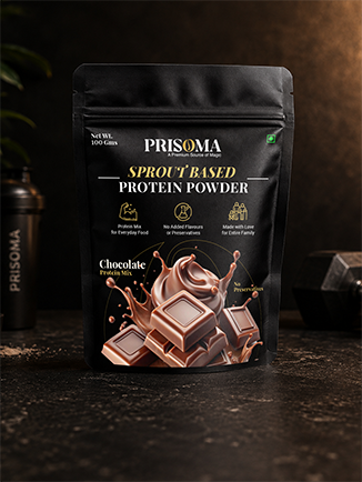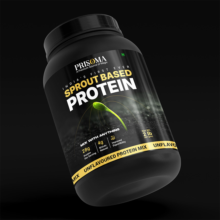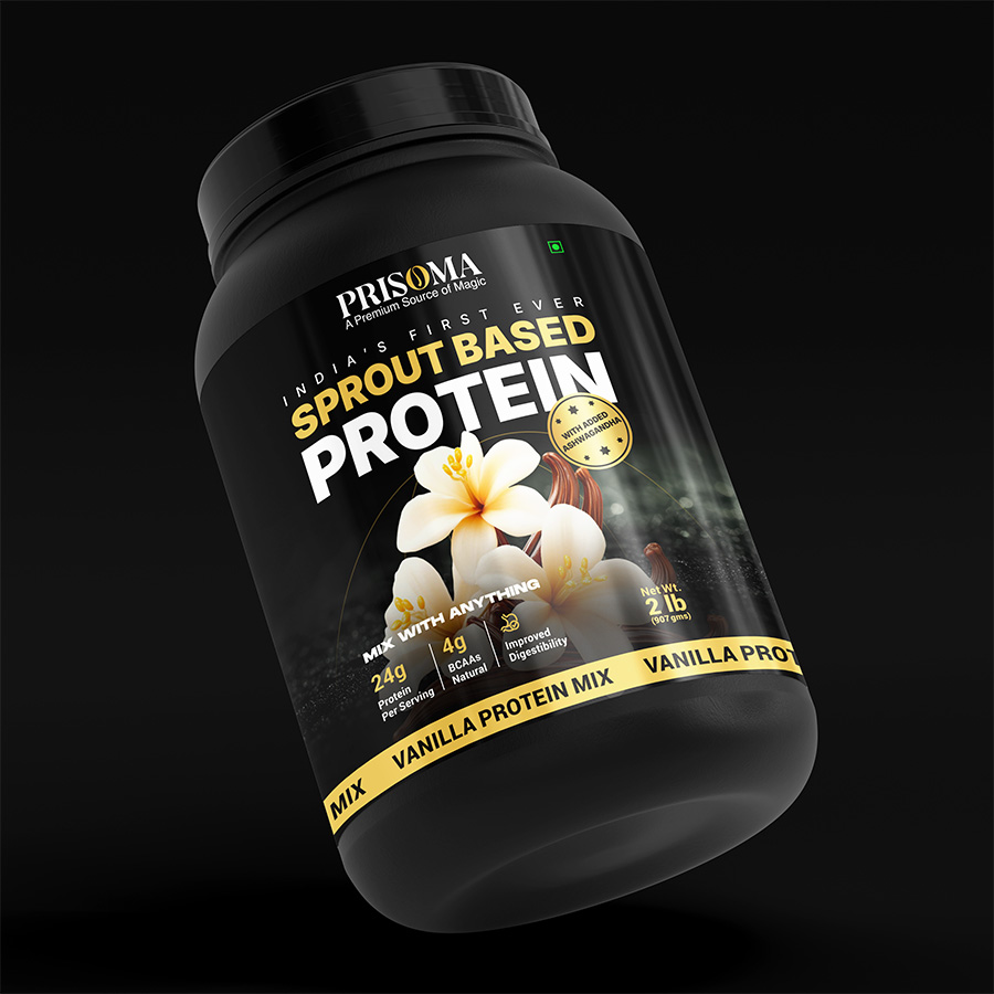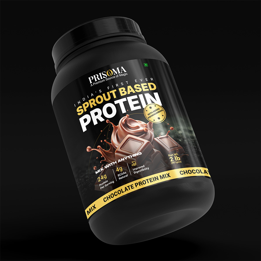
Rooted in New Beginnings
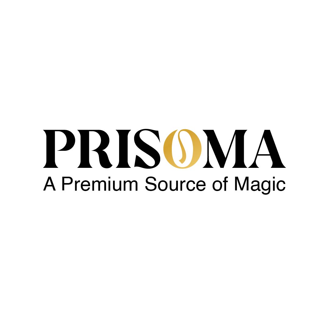
Every great identity hides a story in its smallest detail. PRISOMA's is hidden inside a single letter.
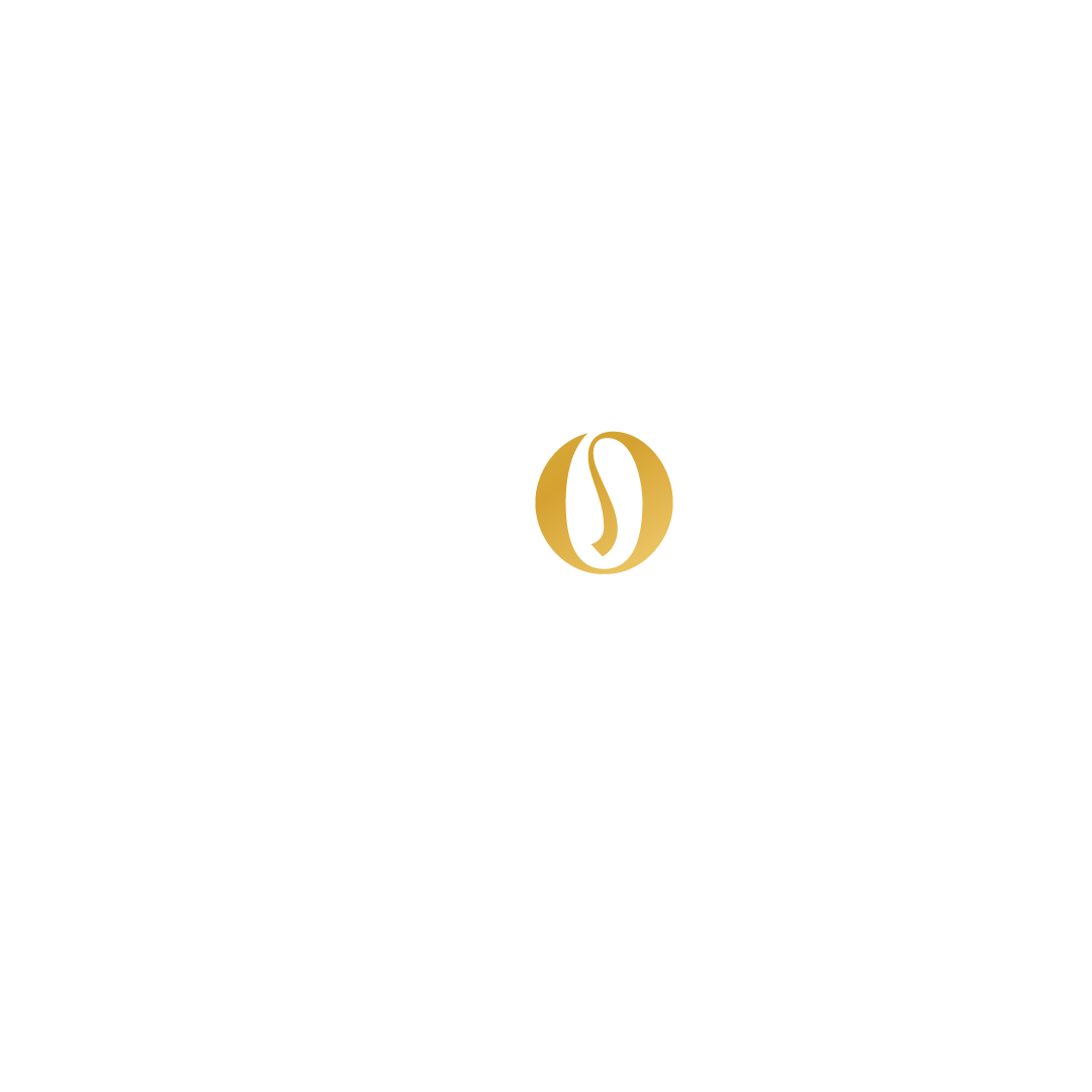
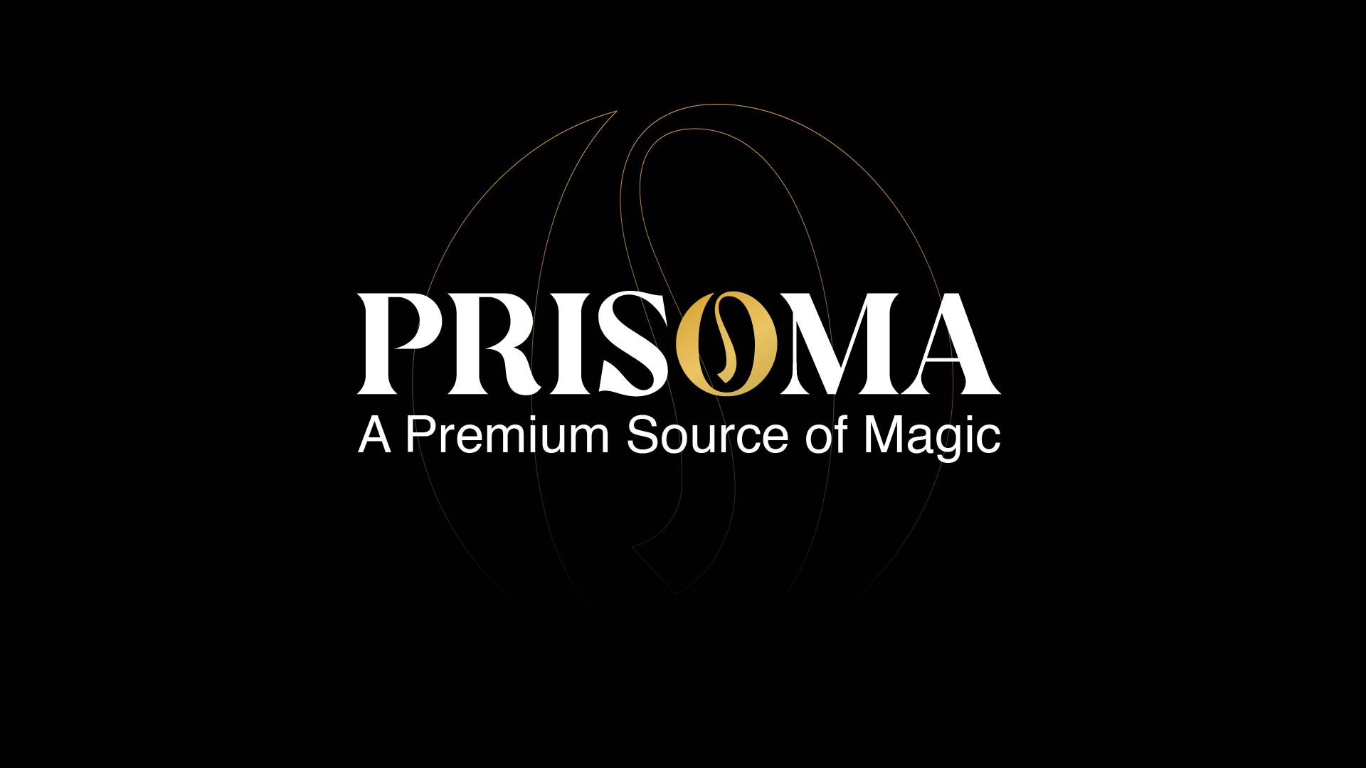
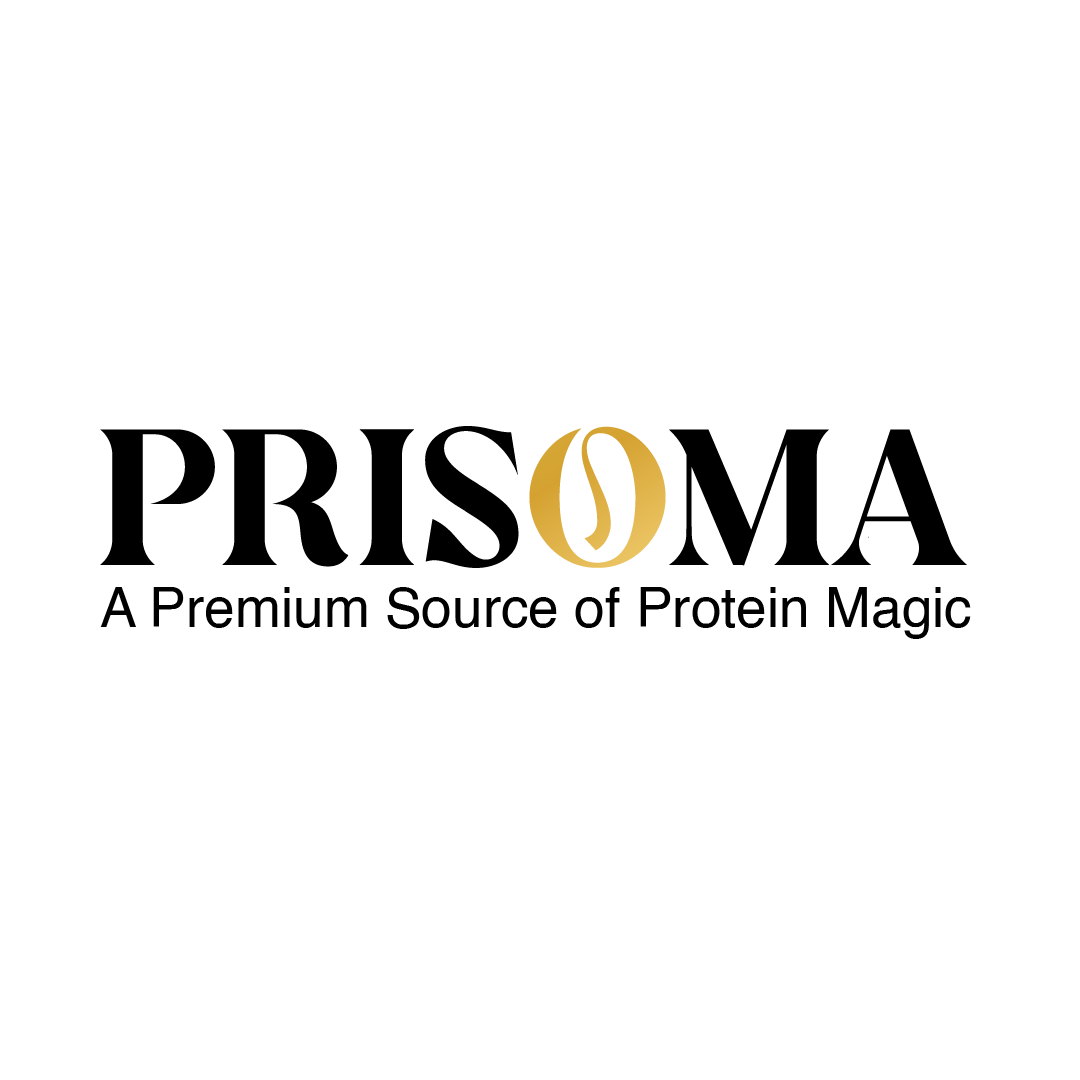
- The custom "O" is inspired by a sprout, symbolizing the beginning of better nutrition.
- The negative space inside the "O" creates a subtle sprouting form without making it look like a literal leaf.
- The flowing signature-style lettering reflects a modern premium lifestyle rather than a traditional nutrition brand.
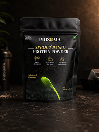
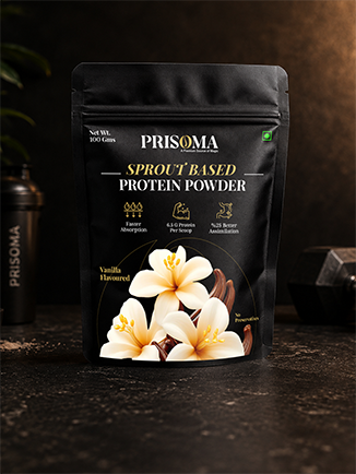
- The logo intentionally avoids gym or bodybuilding cues, positioning PRISOMA as a premium everyday wellness brand.